Sankey
Overview#
A sankey diagram is a visualization used to depict a flow from one set of values to another. The things being connected are called nodes and the connections are called links.
Sankeys are best used when you want to show a many-to-many mapping between two domains (e.g., universities and majors) or multiple paths through a set of stages
Data Format#
Sankey diagrams require the following structure:
The number represents a weight value between the two strings. In the upcoming example, this weight is simply the occurrence count of the combination.
Form Layout#
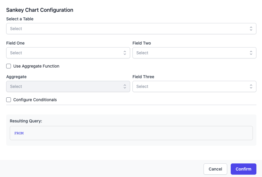
The form is structured in a way which enforces the data format required to load the chart. The third field has the optional aggregate option, which allows you to perform an aggregate on field three if it is not a numeric field.
If you are unfamiliar with SQL Aggregate Function, please feel free to review the following resources:
- 1
- 2
- 3
Example#
In this example, I will use a Sankey to chart Genus in the museum collections database with their Collectors. For visual clarity sake, I will be heavily restricting the query with conditions, so the chart does not get overly populated.
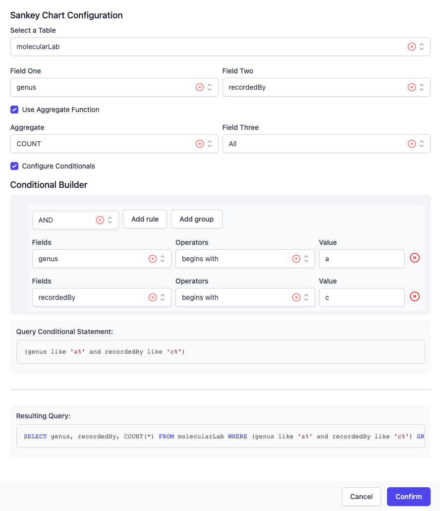
I am selecting the genus and recordedBy fields, which will correspond to the first two string fields in the data format requirement (in that respective order).
I am restricting the data to reduce it by requiring genus to start with the letter 'A' or 'a' and recordedBy to start with the letter 'C' or 'c'.
The resulting, formatted query is as follows:
This query will render the following chart:
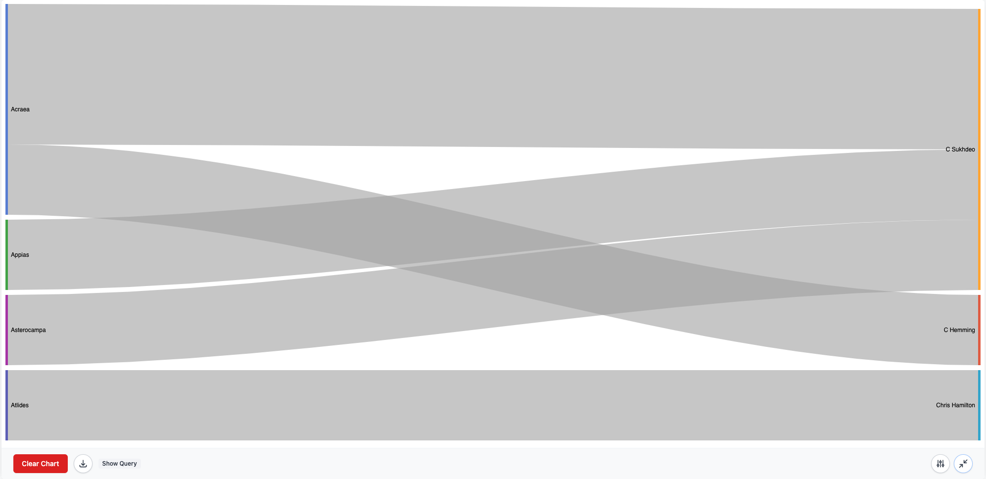
Note: this renders rather small in the browser, I suggest 'opening image in a new tab' for best viewing